Scaling a modern website.
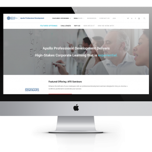
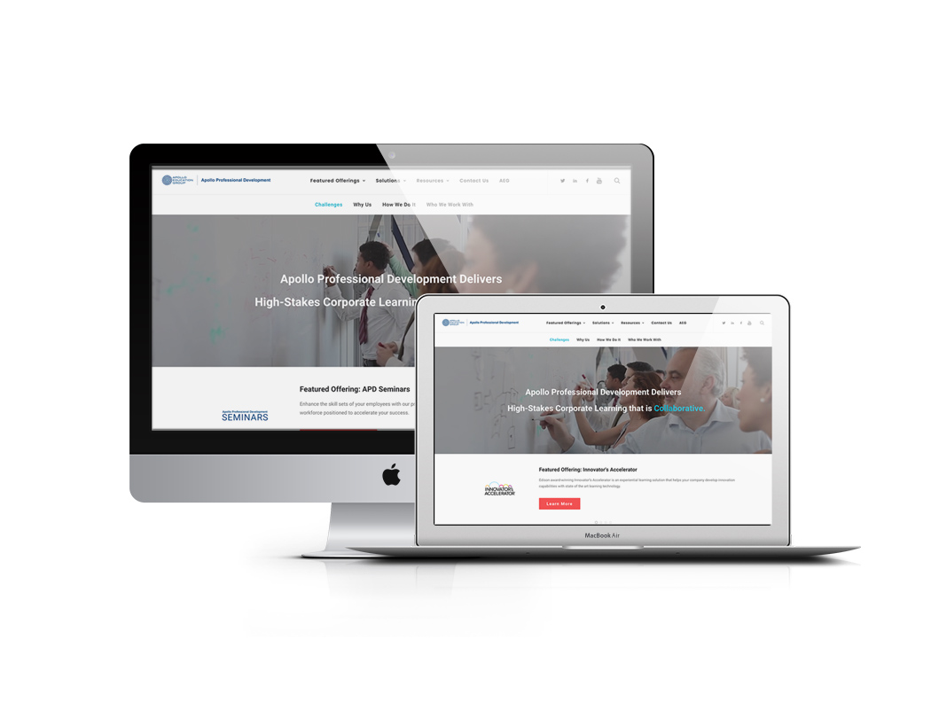
Acting as the only developer alongside a copywriter and manager, I took Apollo Professional Developments (apart of Apollo Education Group) original microsite that existed on its parent company’s site to a 5 page website, and then in version 2 – to a 150 page dynamic site full of articles, case studies, new stories and structured course offerings with modern analytical tracking, SEO and updated branding. I did this while maintaining the parent company’s other 2 websites (Innovator’s Accelerator and Leadership Ace) and designing/developing cross-client friendly email and social campaigns.

About Apollo
Understanding the client before a rebrand
Apollo Professional Development is an international corporate education company operating under the house of Apollo Education Group who most notably owns the University of Phoenix and The Iron Yard. APD focuses on business-to-business training, upskilling and reskilling. They emphasize their unique and fun corporate learning experiences in a land where learning is dull and ineffective. What they stand for is progressive but their web presence didn’t reflect that. I created and implemented a plan to change that.

A Custom Story
Subject to change
Around the time I was brought onto the Apollo team to be the first in-house developer and designer, the company was in the midst of large scale changes. It had just been bought out and in the middle of a negative reputation battle, my small team and I were unknowingly tasked with rendering that reputation through a new web presence.
Prior to being hired, Apollos digital presence was being outsourced by several different agencies, none of which had communication with the other. As expected, this created a distinctly uncoordinated and outsourced look. No two digital elements were the same and not much had been taken into consideration. I was hired to replace all of these agencies.
During this time the band of Apollo executives were able to form a company narrative and I was left to digitally represent their story.
Working solo in a rapidly changing company, I quickly learned that the website’s visual responsiveness wasn’t the only flexibility needed.
The company’s storyline was constantly evolving and content was constantly being added. In this environment I found it best to setup dynamic post-type content for articles and case studies. But more specifically I had to consider the possibility of expansion in each section when designing a new page, or thinking about the site structure as a whole.
As the new company narrative was evolving I was still expected to produce deliverables. Quick wireframe sketches became a starting point to open the conversation of aesthetics and functionality.
According to Search Engine Watch, desktop visits last 3 times longer on average than mobile visits, with more pages viewed and half the bounce rate. The reason isn’t hard to guess: when mobile users land on a page, they don’t want to pinch and resize, they demand a mobile-friendly, responsive design to guarantee smooth browsing.
–


