Contract Wrangler is a legal-tech startup based in Silicon Valley, focusing on contract automation by using AI and machine learning.
After designing and building Contract Wranglers website, I was promoted over to their front-end engineering team to work on their software products. While there was a small UX team, and larger development team (however, I was the only state-side developer) there wasn’t anyone who crossed the lines between both design and development. That’s where I came in. I worked with design to help them understand the potential or limitations of their concepts, and development to build and deploy those designs. The bridge between design and development is often missed but when done correctly, can optimize work for everyone involved and ultimate create a better product.
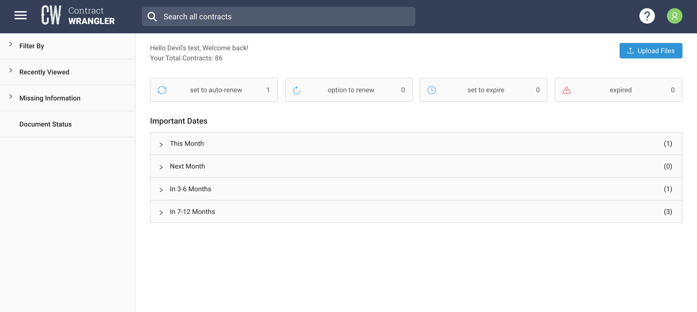
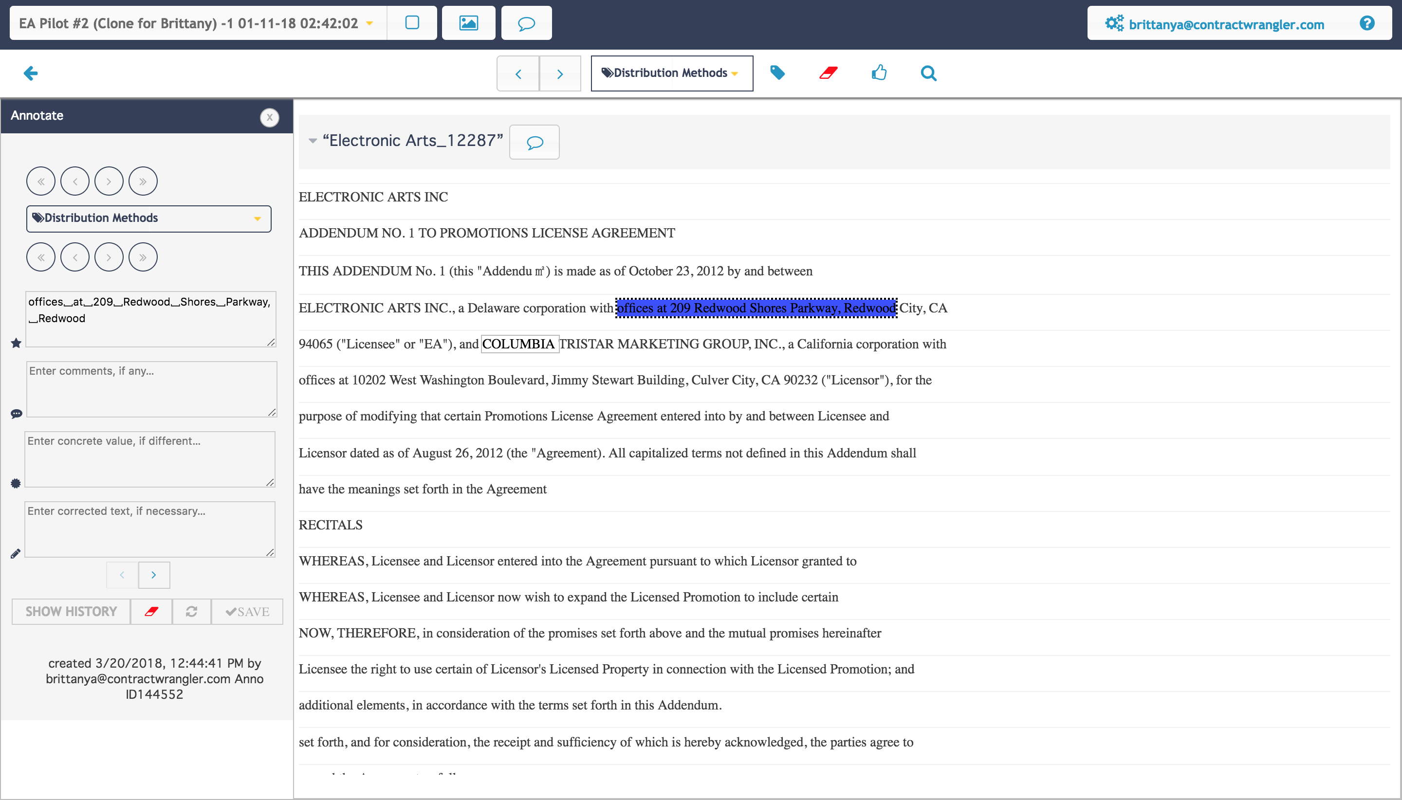
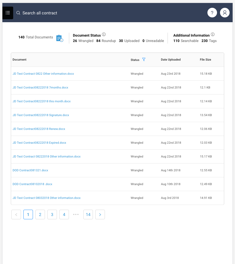
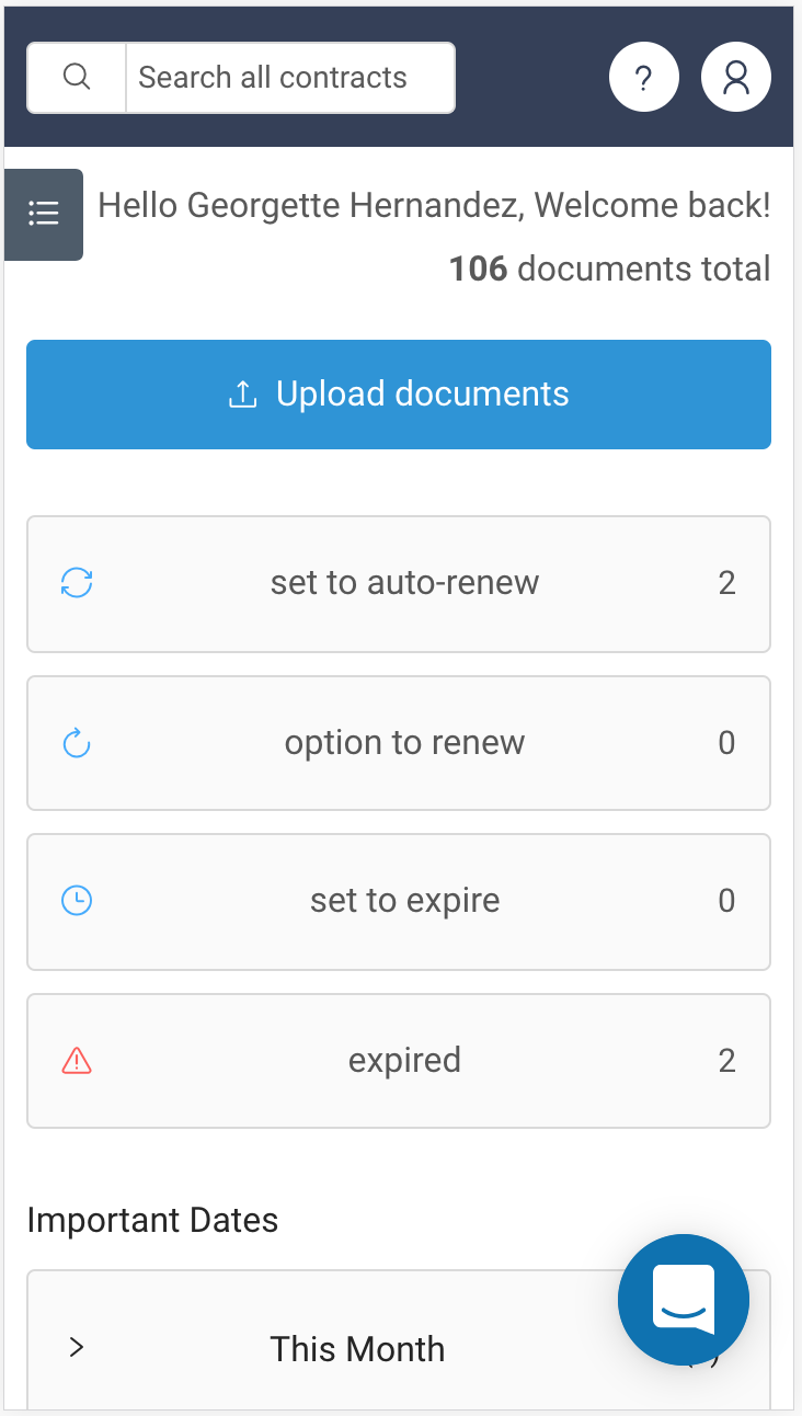
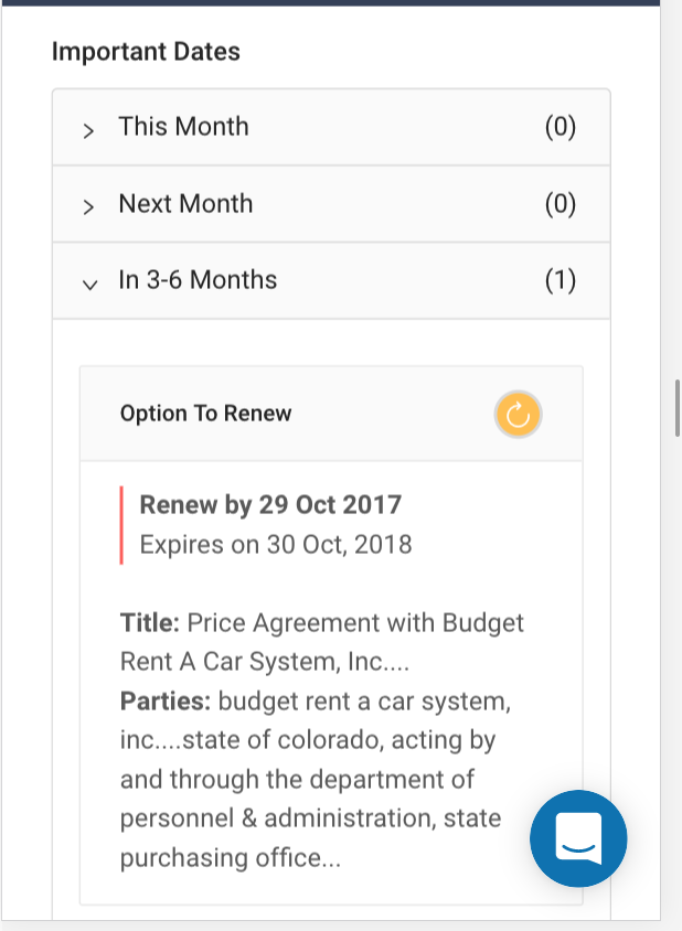
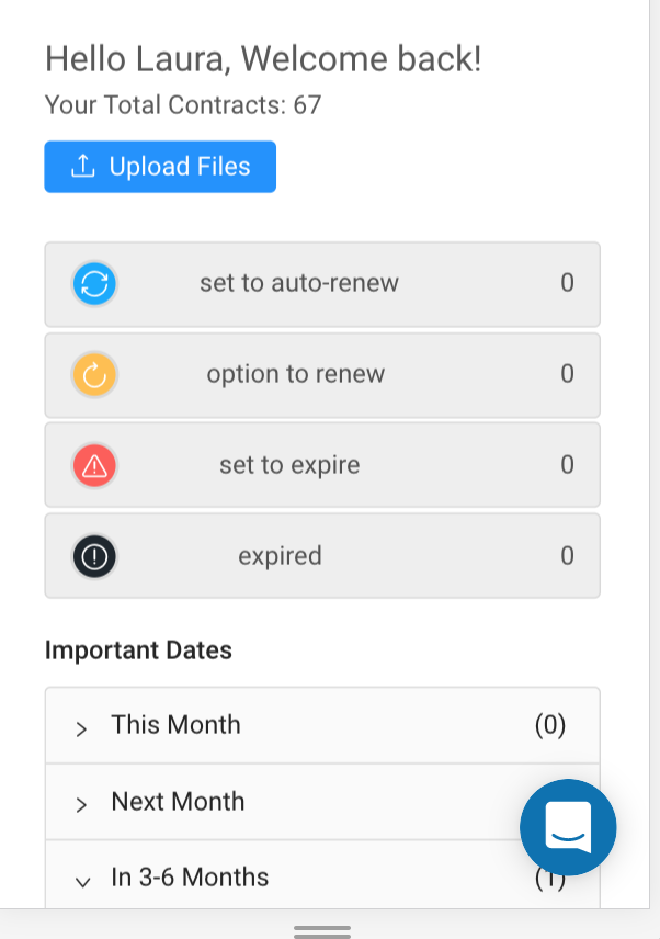
Image 1 After: the design I created and built
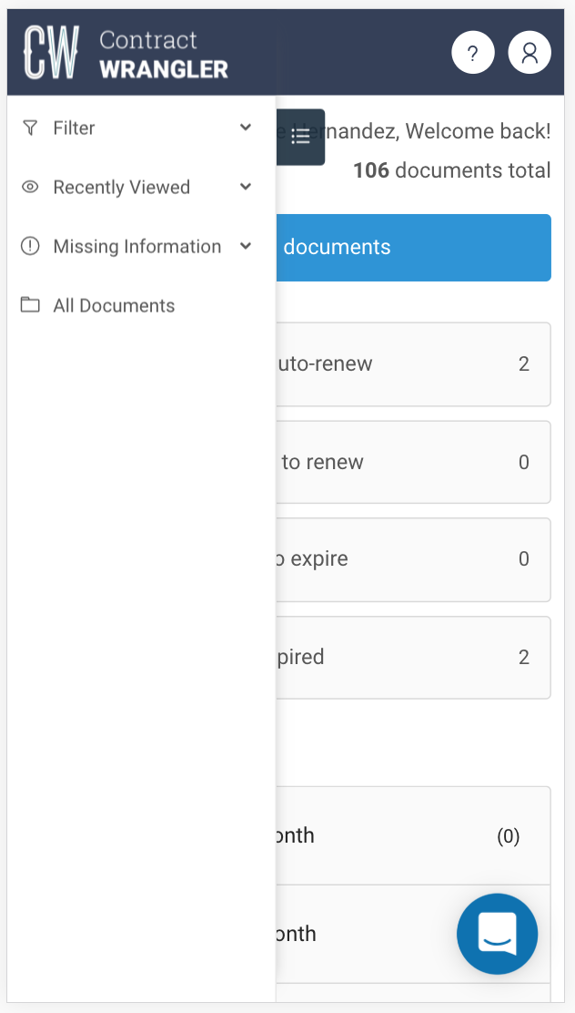
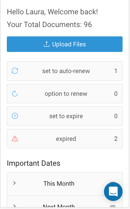
Image 2 Before: the existing design
Software Product 1: Client-Facing Webapp
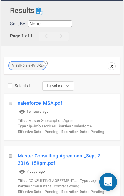
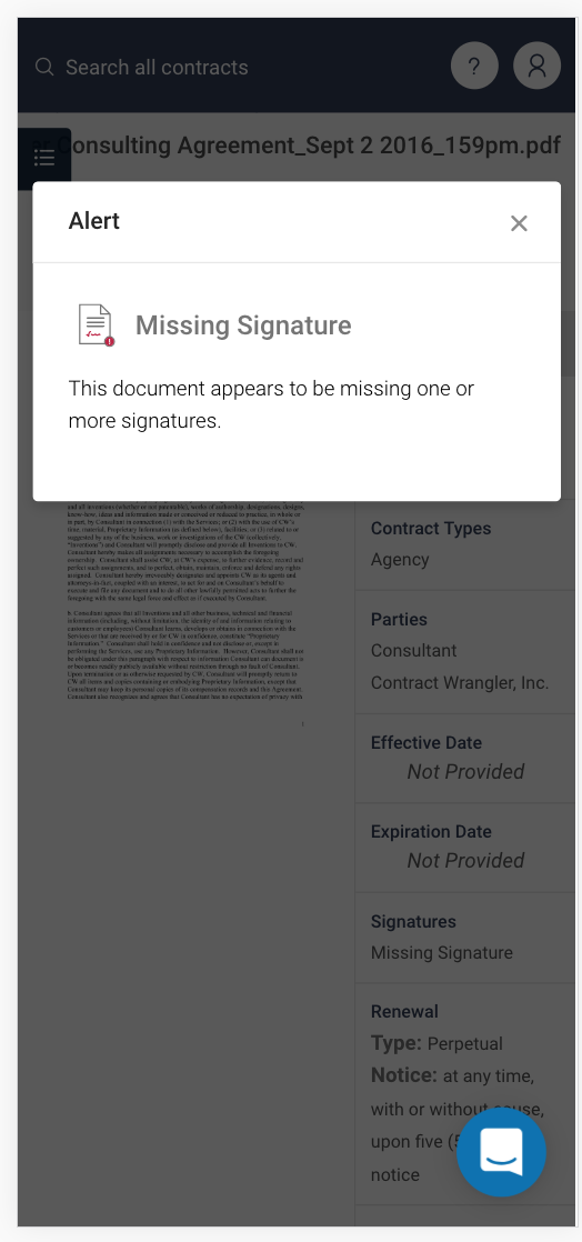
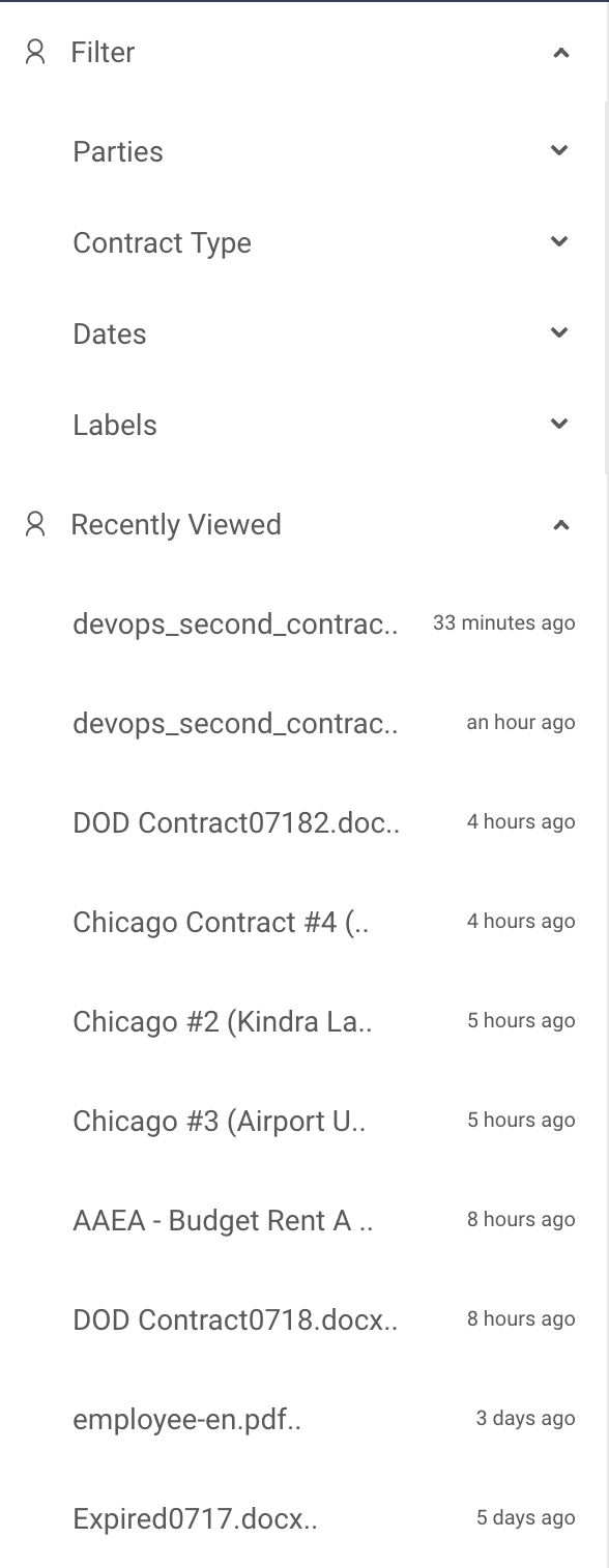
Contract Wranglers webapp tool is used by clients to manage their huge sets of internal business contracts. Often these contracts are in paper form and uploaded as image files. These are fed through image recognition MLS (machine learning), to generate a text file that is easily digested and organized by attributes important to that specific document/company (contract expiration date, parties involved, etc). These attributes are distributed to internal organizational tools that do things such as alert the user if a contract is about to be up for renewal, or expire, therefore avoiding potential headaches or losing money.
The first problem I raised as I joined the engineering team was that none of the products were mobile responsive and that it should be a priority for a client-facing app. Not only were the platforms not mobile responsive, but they also were not responsive in any form (cross-browser, or even having respect to different screen sizes). This was the first project I took on. Over the course of two months, I combed through verbose front-end code, rewriting in a way to minimize, optimize and embrace responsiveness.
As I rebuilt I realized how inefficient building everything from scratch was, and that we should either develop our own design library or utilize an existing one. After consulting a few industry experts we decided to adopt an existing one. And after extensive research, we landed on Ant Design. This led to a series of redesigns to incorporate the design library and clean up the endless inconsistencies in the UI, all of which I took on single-handedly.
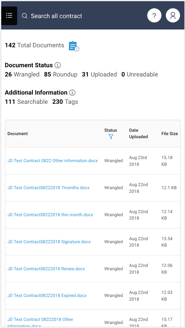
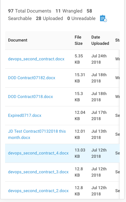
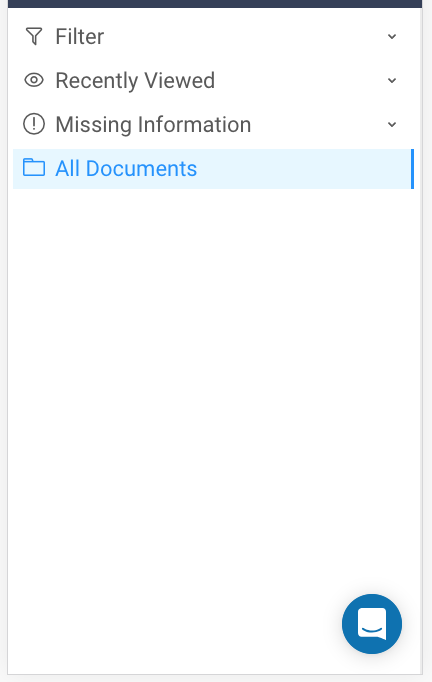
Software Product 2: Eva, internal tagging tool
Eva is the Contract Wrangler tagging tool. Currently, lawyers use this tool to take client contracts (post-image recognition) and tag the important pieces of data according to the attribute they belong to. This will eventually be phased out entirely by machine learning but is currently a way to train the ML system.
The first project I took on with Eva was to redesign it in a way that helped the efficiency of the tagger. Time is money especially when it comes to hiring lawyers, so the faster these taggers were able to get the job done, the happier everyone is.
Rethinking the user experience of Eva took a lot of research, understanding the hierarchy of information that the taggers needed access to and why was of utmost importance. The original (at the time in-use) version of Eva held a lot of negative space and redundant interactions that I felt extremely vital to fix. But we had to go about it in a way that didn’t bombard the taggers with too much of a learning curve with the new design. It is incredibly hard to untrain a user, especially an audience that isn’t very tech savvy. Which is why I think original go-to-market designs are so important.
I also took the redesign opportunity to clean up the verbose front end code and implement our design library (Ant) to embrace more UI consistencies.
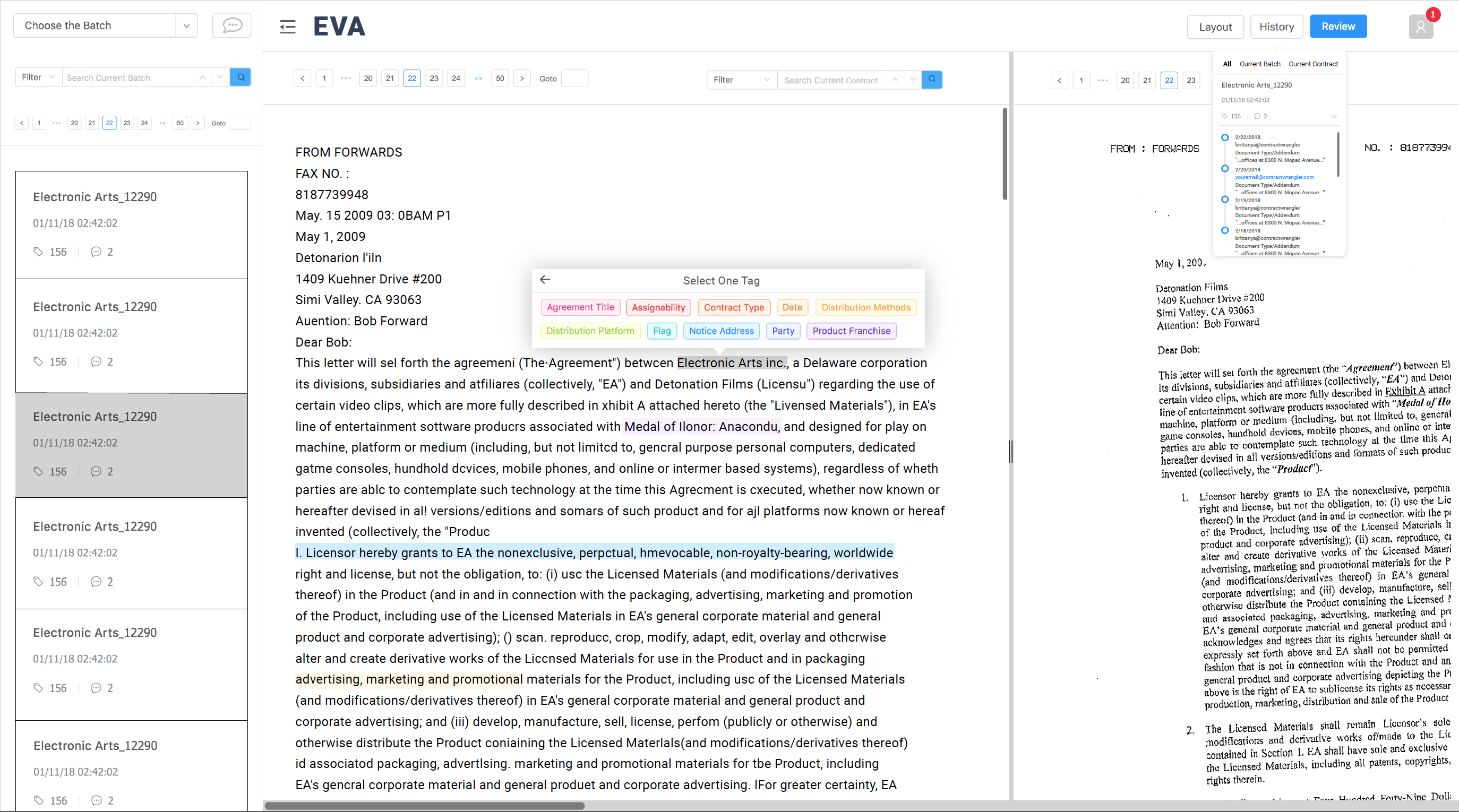
Image 1 After: the design I created and built
Image 2 Before: the existing design